Change.org product design
2015–2016 ·
At Change.org, I was the lead product designer for the largest segment of users of the product: petition supporters. Over the year I worked there, I focused on broadening the experiencing of signing and supporting a petition, with the aim to make users more likely to participate and return, and petitions more likely to succeed.
Petition sharing
My first project was focused on increasing petition sharing, both by expanding the ways to share, and by improving the interactive experience with a better interface and better language. Our theory, as informed by user research, was that some people chose not to share on Facebook but had an interest in sharing through other methods, and we felt the existing experience was not centered enough around user goals.
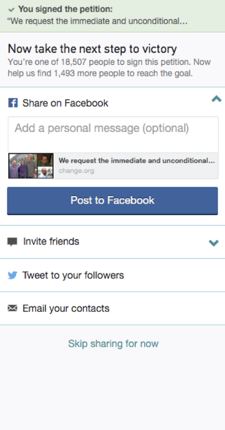
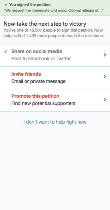
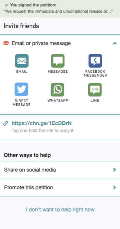
Through a series of design explorations and A/B experiments, we tried a number of ways to solve this. Ultimately, we did increase the ways people could share, and improved the experience, but we also found that some methods of sharing were rarely used and others resulted in very little follow-up traffic to the petition.
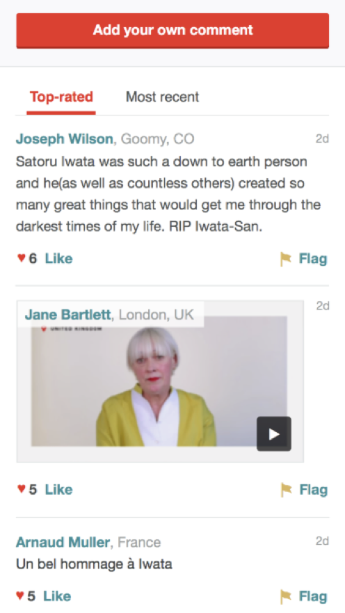
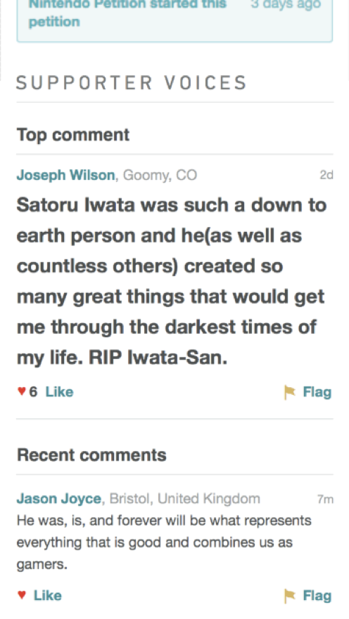
Supporter voices
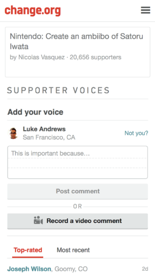
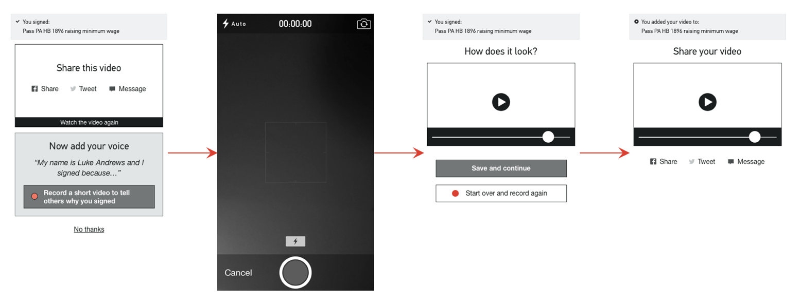
In this project, I designed ways to increase supporter participation with an expanded comment section. We designed and tested simple scenarios to see if users would be receptive to watching videos from other supporters and potentially recording their own. We shipped a new, expanded comments feature with the ability to “like” and share comments, but postponed the video comment idea because of the technical complexity.
Petition information architecture
As I worked on various new concepts for petition supporters, I felt that the existing information architecture of the petition did not provide an adequate foundation to expand the overall experience. The page did not offer any wayfinding, nor did it intelligently adapt to different stages of the experience, such as someone returning for the second time or tenth time. It was not obvious how to add new kinds of metadata like location and tags. Because of this, I proposed a project to revisit the architecture of the page and redesign it to support new proposed elements as well as to become a solid base for unknown future ideas.
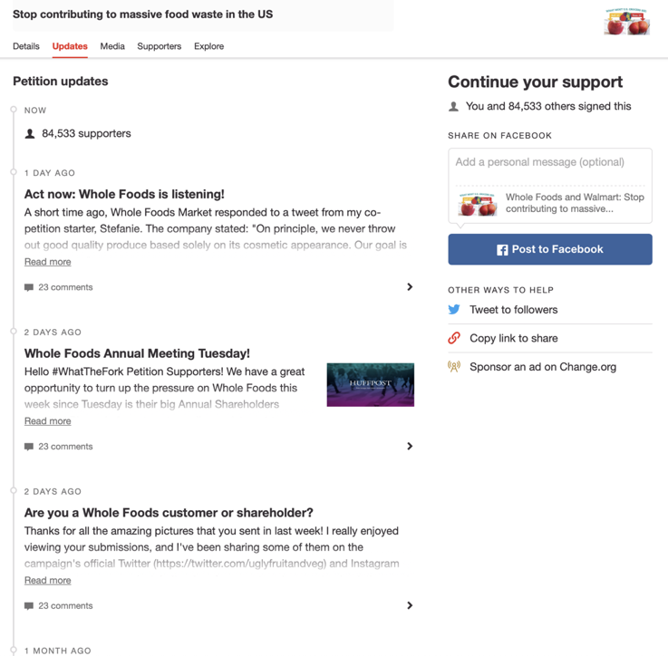
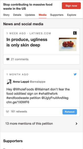
My initial work was to dissect the page and highlight its weaknesses in order to build support for the project internally. I then designed a series of conceptual improvements, all with the aim of making it possible to build them iteratively, knowing that was far more likely to occur than trying to rebuild the experience from scratch. The project was well received by the team, and we succcessfully shipped some aspects of it before I departed the company. —L.A., November 2019