Simple isn’t enough
22 August 2012
Over at Slate, Farhad Manjoo sings the praises of Microsoft's new Outlook. He writes:
In fact, other than Gmail power users, most people will likely find Outlook easier to use—and more enjoyable—than Google’s now aging email service. There are a couple reasons for this. First, Outlook is gorgeous—it’s the best-designed Web email service I’ve ever seen. Second, Microsoft has finally done away with graphical ads, and the text ads that remain are less intrusive than Gmail’s.
It's true that this new Outlook is attractively minimalist. Gmail, by comparison has become arguably ugly. But it's not merely the cosmetic appearance of Gmail that is bad, it's also the misuse of color and space that rankles. 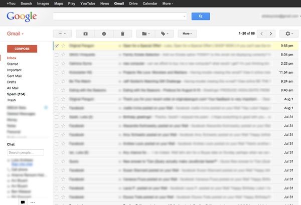 In a functional design, color should help call your attention to important elements. Gmail instead draws your attention to unimportant ones, like the huge, red COMPOSE button and the omnipresent Google logo itself. The sidebar and toolbar are white, while the messages — the most important thing — are dimmed with grey. And a massive search box, armed with a giant, blue submit button, helps push the messages down so they only get two-thirds of the screen on an average laptop screen. Finally, squirreled away in a cog menu, is the "Display Density" setting that offers three choices, yet not one that is actually good. "Comfortable" and "Cozy" are nearly identical, and far too spacious, while "Compact" is too dense.
As Manjoo points out, Outlook makes judicious use of space. The message area takes up most of the screen, with adequate space between each message. What little color exists has been applied sensibly. Message action buttons are labelled with text, not mysterious icons. (Quick, guess what the grey octagon with an exclamation mark means!) In keeping with the general æsthetic of Metro, er, excuse me, "Windows 8-style UI", the look is flat, square and spare. The lack of clutter is refreshing, especially in something like the new message screen. There is no visible border around the title or message boxes; they're just blank spaces.
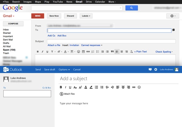
Outlook, then, seems to strive for simplicity, that rallying cry of user interface designers everywhere. There is very little to click on each screen, and when there are fiddly details, they're generally hidden by default, like the CC/BCC options that require an extra click, or the message commands that appear only on hover. I strive for this type of experience in my own work — revealing complexity as its needed rather than all at once. Still, as I started to explore Outlook more in depth, and I used it for longer, it started to seem a bit too simple. There were gaps in the experience, missing pieces I've grown accustomed to in other email products. I recalled something I read on Buzz Andersen's blog only two days earlier:
As I’ve said here before, way too many people in the tech business today equate fetishistic minimalism with compelling product design. Knee jerk reductionism is just as misguided in its own way as the bloatware of yore.
Anderson was rightly praising a comment by Nathan Shedroff, written in response to an article by Aaron Levie called "The Simplicity Thesis". Levie, the CEO of Box, argues that tech companies that simplify experiences will prosper, and even says, "simplicity is a relative, moving target. The accelerating speed of innovation ensures that you’re never the simplest solution for long." Shedroff takes him to task for conflating simplicity with clarity. "Clear isn't eliminating features from systems but arranging them to be found and available JUST when they're needed in a context that is natural and 'obvious.'" Precisely.
As I said, Outlook does this in part, but it also simply avoids many features that I would argue define the pinnacle of an email experience. A simple example: I often find it invaluable to refer to previous emails while writing a brand new one. In a desktop email client, this is simple enough — simply toggle windows. On the web it's not as trivial, but Gmail lets you break an email out of the current window to do the same thing. Outlook? You have to save your email and back out of it to see anything else.
Another part of the modern email experience is blending text and images in a message. Again, on any desktop email application, this is no problem. You can drag an image into the editor wherever you like. Gmail offers this feature too, with proper support for drag-and-drop. Outlook has a simple "Attach files" button, with no option for where such an attachment will appear.
Gmail is rightly known for keyboard shortcuts, and happily, Outlook can emulate those. But little things I do every day in Gmail with the keyboard, like select a few messages at once and archive them, don't work in Outlook. (You can't select more than one message with the keyboard.) And some shortcuts work in some places, but not in others. To be fair, these may simply be bugs, and Outlook is still "preview" software. But ask anyone who uses a piece of software day in and day out and they will quickly tell you the things that drive them the craziest — things that only become clear after repetitive use. Software is never really simple, and if it is, it's probably not finished because there's an important detail you've missed. There's a lot to be said for software that feels effortless, and Outlook has a good start there, but unless Microsoft truly intends this to be a "beginner" email system, they have more work to do.